Why this problem
Approval flows are a pattern I kept meeting in complex enterprise products. They look simple on a whiteboard and become hard in the interface: every role sees something different, and a single “save” has to mean several things.
The problem
Three failures, each feeding the next.
-
Work was lost
Saving was manual. A session timeout meant unsaved work disappeared.
-
Drafts were published
With no draft mode, unfinished diagrams had to be published.
-
Nobody reviewed
With no approval step, poor-quality diagrams spread across the organisation.
Two roles, opposite needs
Research sessions with five companies about how they create and approve diagrams pointed to two roles whose needs pull in different directions.
Role
The Contributor
Creates diagrams and submits them.
- A safe place for unfinished work
- A clear way to submit for approval
- Feedback they can act on
Role
The Manager
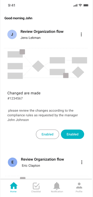
Reviews and approves diagrams.
- A clear moment to review
- Accept or decline with confidence
- Comments directly on the diagram
Insight
The problem wasn’t saving. It was the gap between two roles: one needs room to work unfinished, the other needs a clear moment to judge finished work.
Making the states explicit
The complexity becomes manageable once every diagram is always in exactly one state, and every role knows what that state allows.
-
Editing
Auto-save protects every change.
-
Draft
Saved, revisitable, not published.
-
Submitted
Waiting for a manager.
-
Approved
Published to the organisation.
User flows and information architecture
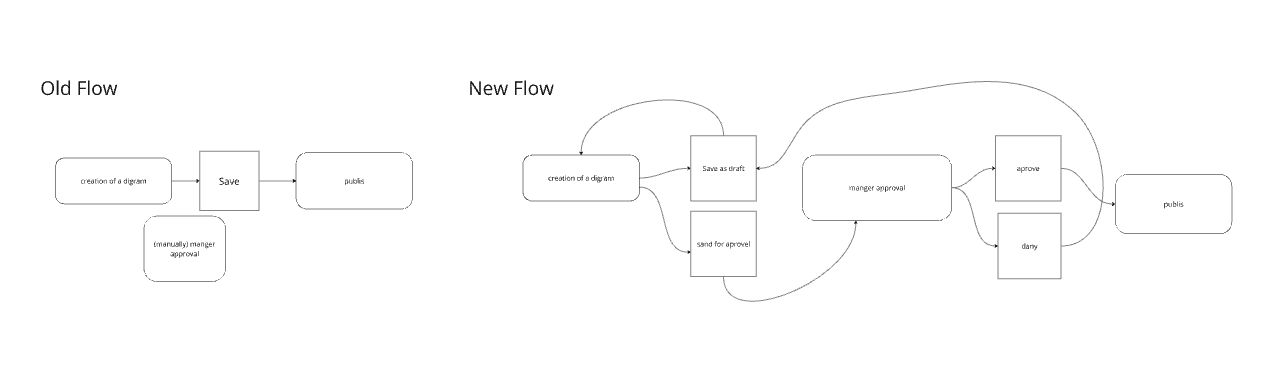
Mapping the existing flow showed where work was created, saved and shared without any checkpoint. The new flow adds three: auto-save, draft and approval, and it was checked in user interviews against the habits of desktop users moving to the web.
Design decisions
Decision 1
Saving is no longer the user’s job
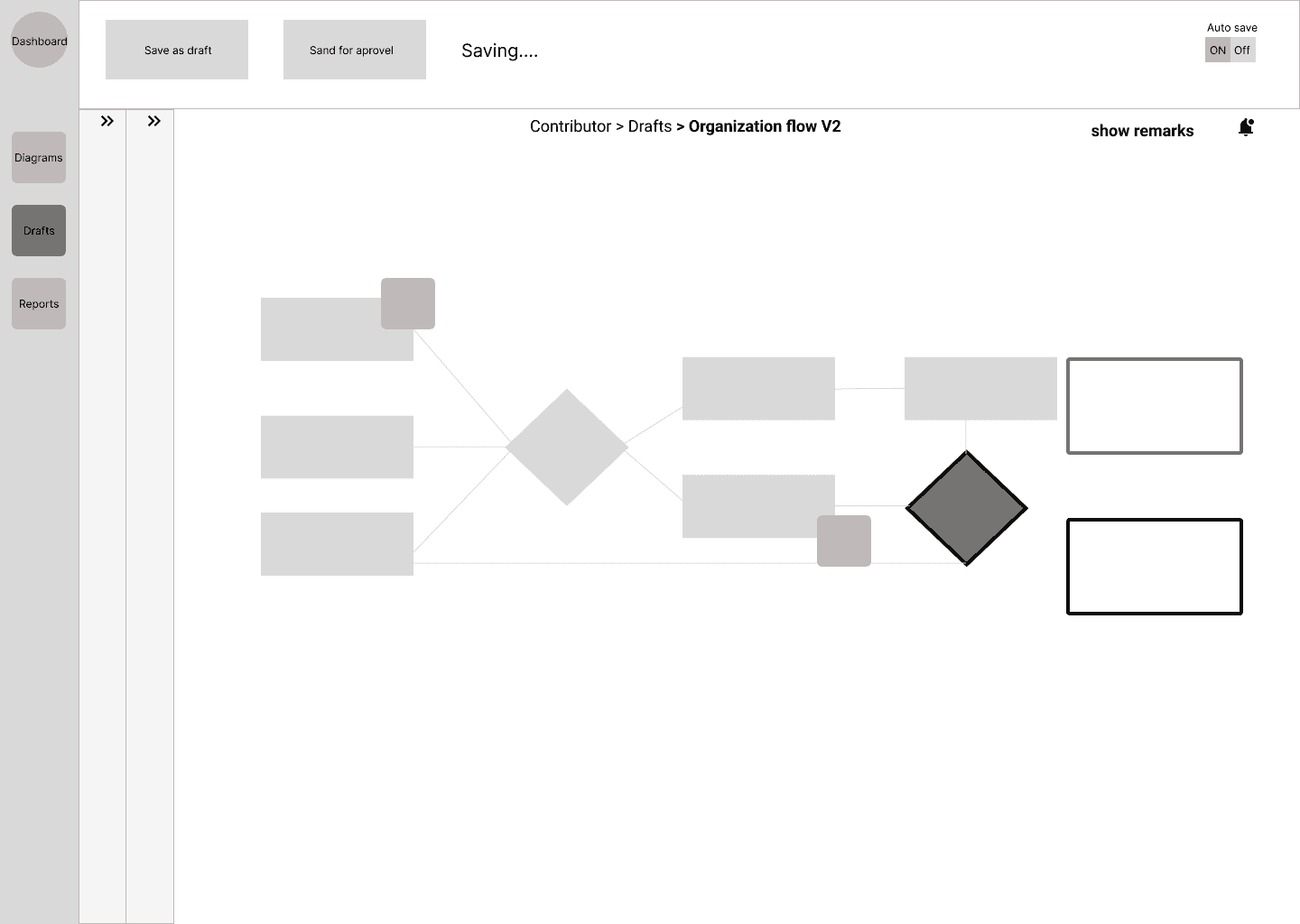
Progress saves automatically, so a timeout or a missed click no longer costs work.
Decision 2
Draft is a state, not a workaround
Unfinished work lives as a draft and can be revisited without publishing it.
Decision 3
Approval follows permissions
Diagrams need a manager’s approval before they are published, so quality and consistency are built into the flow.
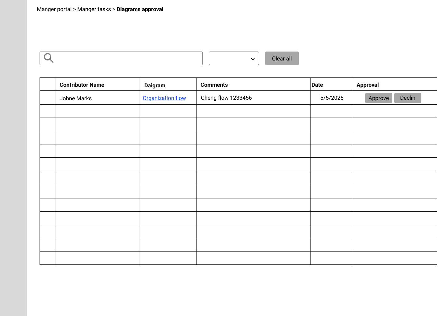
Where should a manager review?
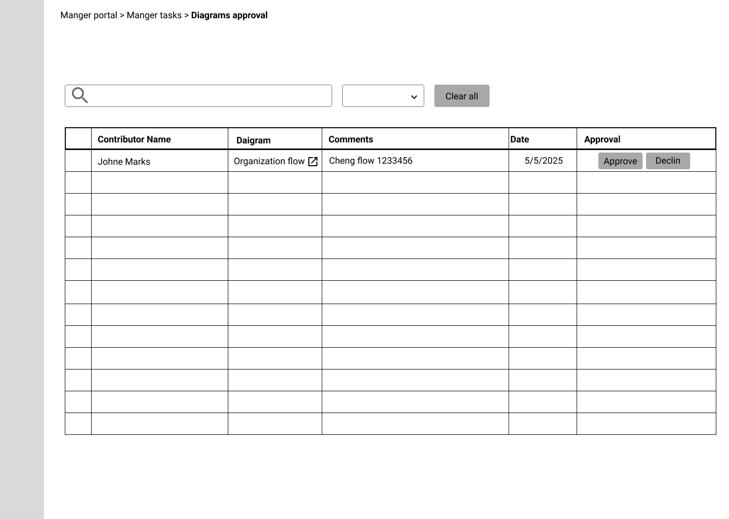
First preference
Side panel
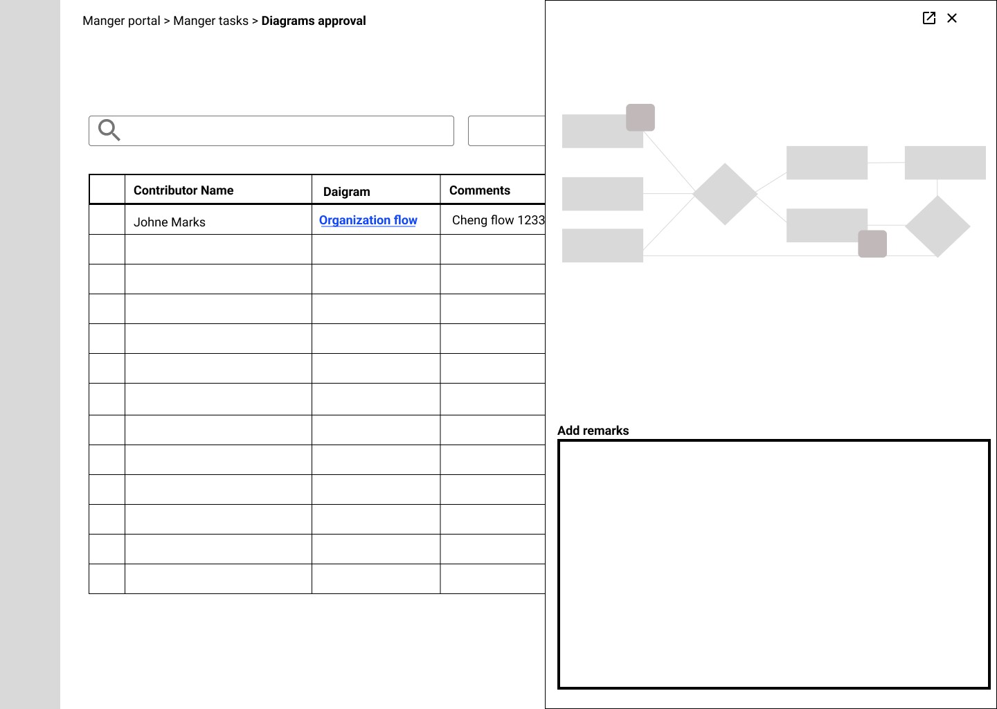
A condensed preview and remarks field next to the list, without leaving it. It felt like the fastest way to review.
Chosen first
New tab
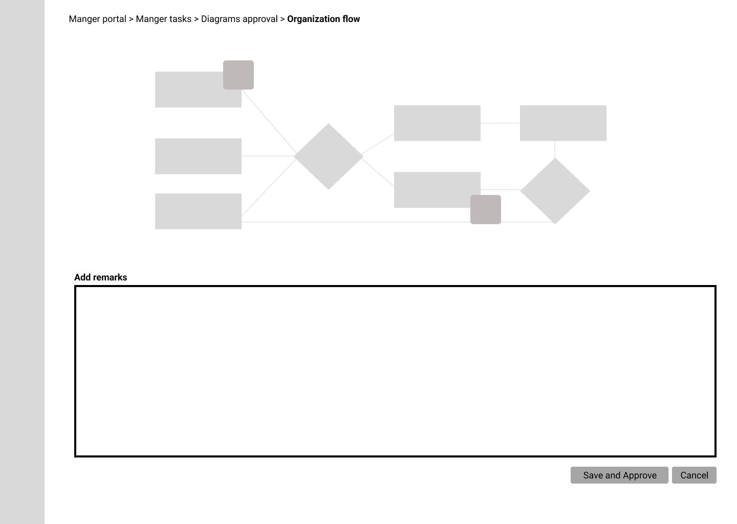
The diagram opens in full, with room for detailed remarks.
Why the new tab came first: it is simpler to build, and a thorough review shouldn’t feel rushed — the more deliberate experience suits the job. The side panel stays open for later testing, to see whether it really adds value.
Final experience