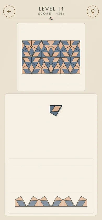
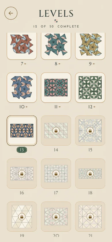
Context
Pattern Pieces is a self-initiated product. I treated it as one from the start: assets had to be original or explicitly licensed for commercial use, every screen had to work on a real phone, and changes went through tests before I looked at them.
- The core loop
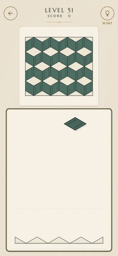
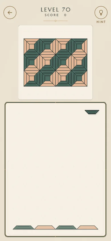
- A piece falls. Tap it to turn it; tap the board to its left or right to move it; press and hold to drop. Rest it on its place in the pattern and it locks in.
- Scoring
- +100 for a correct piece, −20 only for a piece’s first wrong landing, +200 when the pattern is complete. No lives, no timers.
- Content
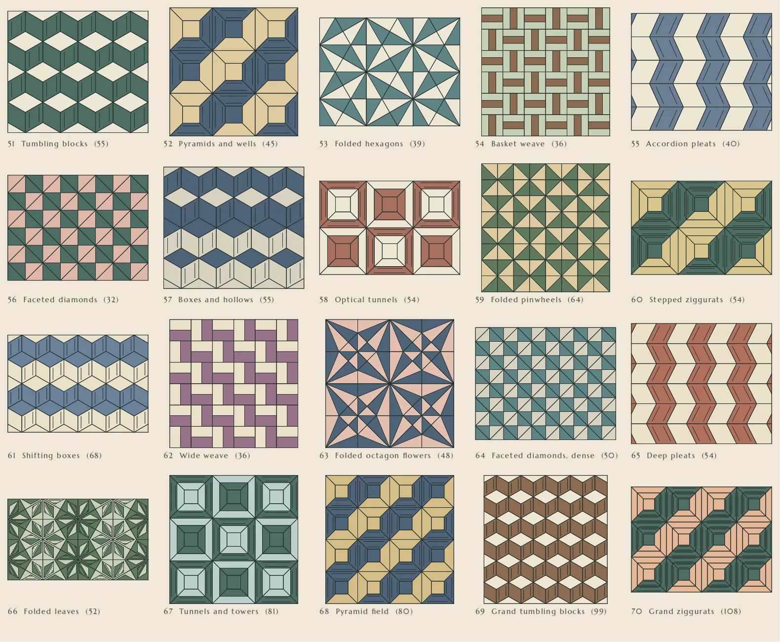
- 70 levels: Penrose patterns built from two shapes, a repeating rosette, and a “depth” chapter of 3D-looking patterns.
Design principles
-
The puzzle is the hero
Lots of negative space, one limited palette per screen, decoration kept to the centre line. Nothing competes with the pattern.
-
Calm, never scolding
No urgency in the copy, no timers. A wrong move is undone quietly and never called “wrong”. One exclamation mark in the whole game: “WELL DONE!”.
-
The piece is the control
No buttons for moving or rotating. You act on the piece itself, and anything that looks like a drag is ignored, so the game can’t misread you.
-
What the hint shows is what the game accepts
The hint, the piece spawner and the placement check ask the same validator. The game never contradicts itself.
-
Pieces are art, chrome is system
Piece colours belong to the patterns. Menus, buttons and headers use the design system’s tokens and never borrow a piece colour.
Interaction model
The screen has two parts that are never confused: the complete reference pattern on top, and the board below, where the first row is already in place and you build upwards from it.
- Tap the piece
- Rotate one step (36° in the Penrose levels).
- Tap beside it
- Move half an edge left or right. Never vertically.
- Press and hold
- Arm the drop: a faint column shows where it will land. Release to drop.
- Hint
- A faint ghost appears on a valid target, pulses twice and fades. It never moves the piece.
A rule system underneath keeps the puzzle fair: a target is only offered if it touches what’s built, nothing sits above it, and it doesn’t roof over an open hole. Automated tests check every reachable state of every level, so a player can never be stuck.
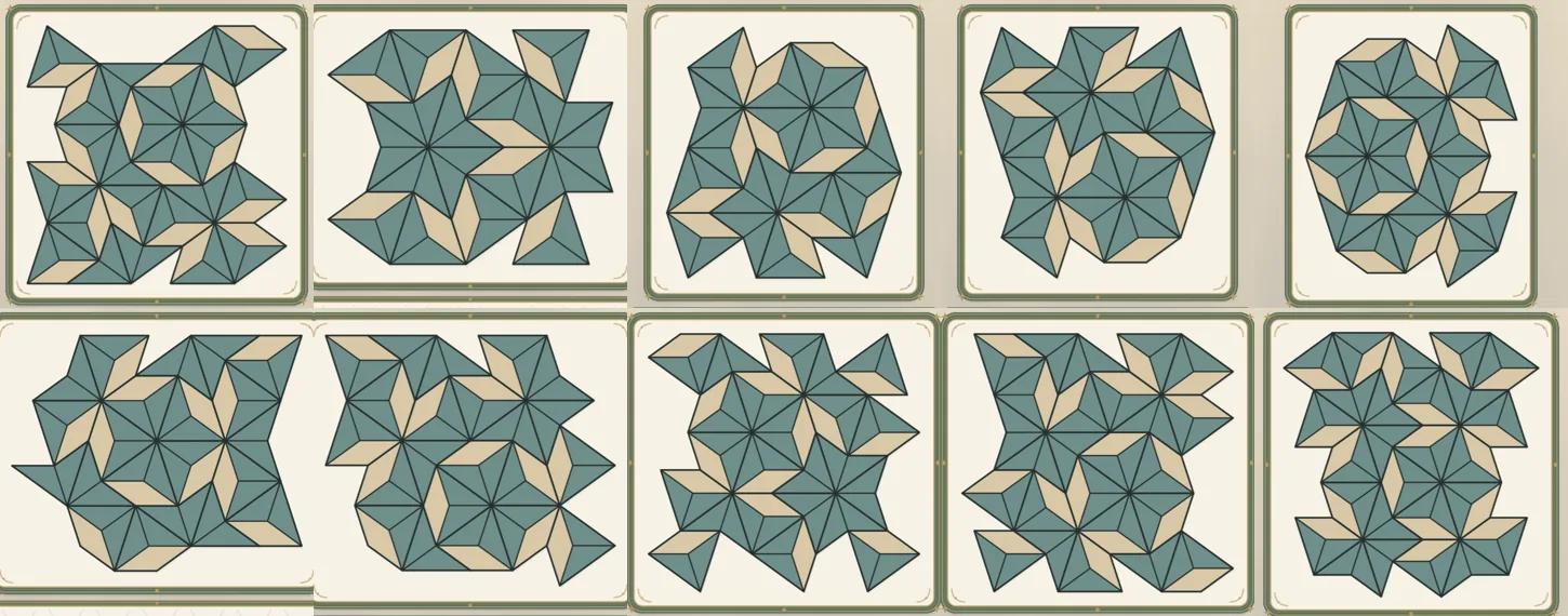
Exploration: finding the right amount of ornament
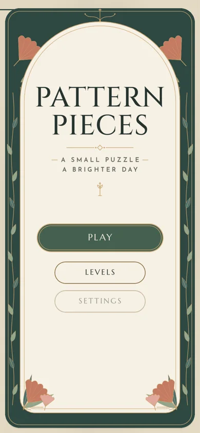
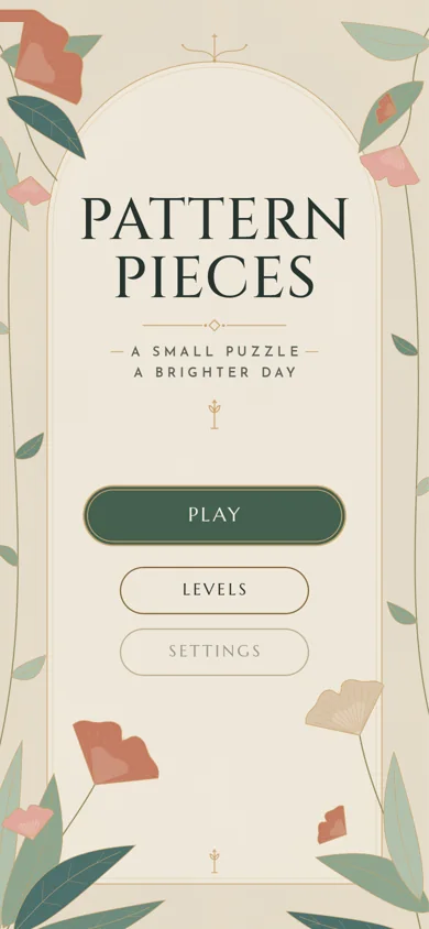
The visual direction started as Art Nouveau and Art Deco on cream paper: botanical frames, vines, blooms. Each pass was reviewed as rendered screenshots at 390 × 844 before the next one started.
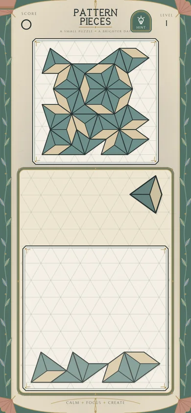
The turning point
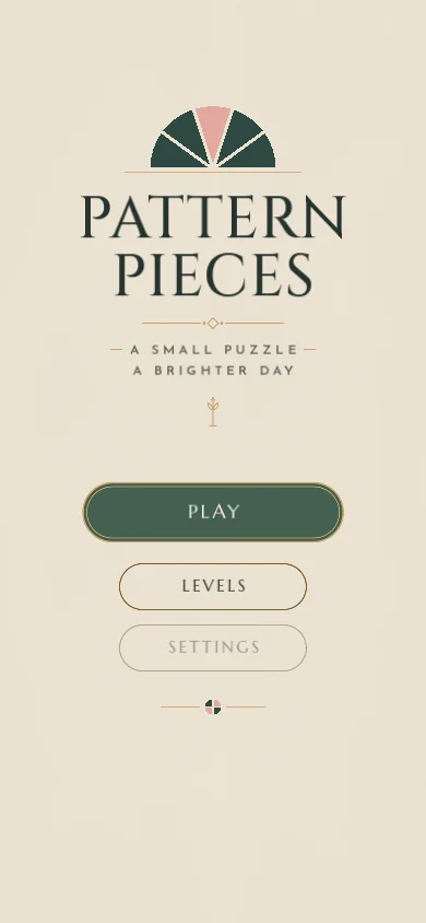
The floral decoration felt pasted on, and it competed with the puzzle. I dropped it entirely: a restrained geometric Art Deco print on warm paper, with the puzzle as the hero.
What replaced it came from the game’s own geometry: a half-sun cut into five wedges on the home screen, and a thin gold rule with a tiny quartered disc that punctuates headings. Gold is used only for hairlines.
From visual language to a working system
-
Principles
Calm, restrained, puzzle first
-
Tokens
Colour, type, spacing, radius, motion
-
Components
Buttons, discs, header, frames, cards
-
Screens
Home, levels, game, settings
-
Interaction
States, feedback, motion
Colour tokens · Parchment theme
- surface#efe6d6Page ground
- surface-raised#f6f0e4Cards, dialogs
- surface-sunk#e6dac5Pressed, tray
- forest#2e4842Deep panel
- primary#44604fOne filled action
- ink#26332fText
- gold#c9a46eHairlines only
- gold-strong#7a5d2fLabels, outlines
- accent#a4452fSmall emphasis
Piece colours · art only, never chrome
- sage#8fa58e
- teal#4d706c
- blue#4b5b80
- sand#d9c4a8
- terracotta#c47a62
- blush#e3a9a0
- gold#c9a46e
- slate#2b333c
Two themes, Parchment and Evergreen. Every text token has its contrast written into its usage note — gold is below 3:1 on parchment, so it is never used for text there.
Type
- Pattern Pieces
- Level 3
- Puzzle • Relax • Create
- A small puzzle, a brighter day.
Three typefaces, three jobs: Cinzel only for the name, Marcellus engraved in capitals for anything read at a glance, Josefin Sans for reading and tracked labels.
Components, as rendered in the game
-
Button
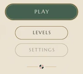
One filled pill per screen; outlined secondary pills about 70% wide, stacked 12 px apart.
-

Level header
Back on the left, level and score centred, hint on the right; 44 px outlined discs with 1.5 px line icons.
-
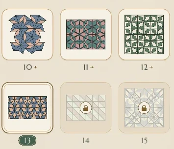
Level card
Four states — current, completed, available, locked — read from the save file. Nothing new is stored.
-
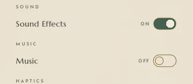
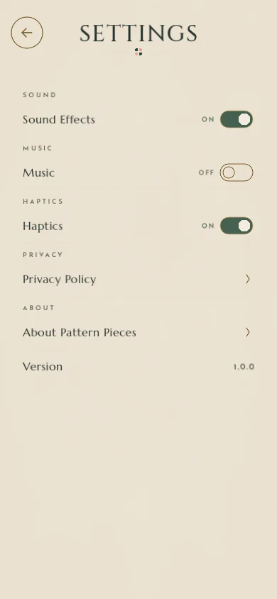
Settings row
Tracked section label, Josefin Sans row label, a primary-filled switch with its state spelled out.
-
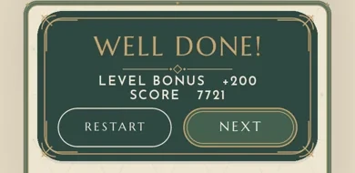
Frame
The one deep forest panel: a level-complete card with an inner gold hairline.
-

Ornament
Motifs taken from the game’s geometry, kept on the centre line.
States, feedback and motion
- Level states
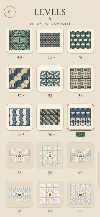
- Current (deep-green frame and number tab), completed (small gold star), available, and locked (a faint wash and a padlock, can’t be opened).
- Press
- Buttons press in to 0.95 over 70 ms and take a slightly deeper fill. Quiet, not bouncy.
- Score feedback
- Every change shows as a small “+100 / −20 / +200” under the score: in over 120 ms, held, then fades. A change that didn’t happen (−20 at zero) isn’t announced.
- Placement
- A thin gold outline fades as a piece locks in. A finished pattern gets a quiet seal: a gold line and four small stars at the panel edge.
- Completion
- The card fades in and settles from 96% to full size over 320 ms; its rule draws itself after a short pause.
- What’s left out
- No particles, no bounce, no shake. Motion stays between 240 and 320 ms, ease-out.
How the system was implemented
The design system isn’t a separate document that drifts from the product. Its tokens are constants in the game’s single palette file, and the ornaments are drawn in code from the same geometry. Only the chrome uses them: the patterns and their colourways are untouched.
- One source of colour
- Every colour in the game, including all level colourways, lives in one file. A level’s colourway is a pure function of its position, so it looks the same every time.
- Tested like code
- Unit tests check that colourways are distinct, muted and legible; an end-to-end test samples the rendered screen to prove each level is drawn in its colourway.
- Licensed for release
- Typefaces under the SIL Open Font License, ornaments and paper texture drawn procedurally, audio under a licence that allows commercial use. Nothing traced or copied.
Working with Claude Code
I built Pattern Pieces with Claude Code. I made the product and design decisions, and Claude Code implemented them in Godot. The workflow I settled on:
-
Describe
I describe the composition or behaviour, and approve it before any visual change.
-
Build one slice
One vertical slice or one visual pass at a time, in the existing project.
-
Test
Unit and end-to-end tests run on every change; gameplay must stay intact.
-
Review
I review rendered screenshots at phone size, then decide the next step.
For the beta I set up a feedback log and a product backlog: one row per tester report, duplicates grouped by theme, and priorities set by hand.