The operational problem
Operational information arrives from many places and matters at different speeds. Failing equipment needs attention now; a trend in supplies can wait for the week. The design challenge was to hold all of it without making the urgent things hard to see.
Research
The product was early, so research aimed for a foundation: how managers would use the interface, and the market around it. Internal user interviews and market analysis pointed to three needs.
-
Centralised data
One place for every restaurant: equipment, people and supplies.
-
Financial insight
Managers wanted to see the value the tool created, not only status lights.
-
Permission levels
Different tiers of management needed different access.
Structuring the information
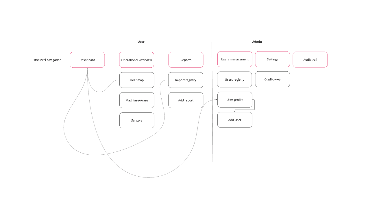
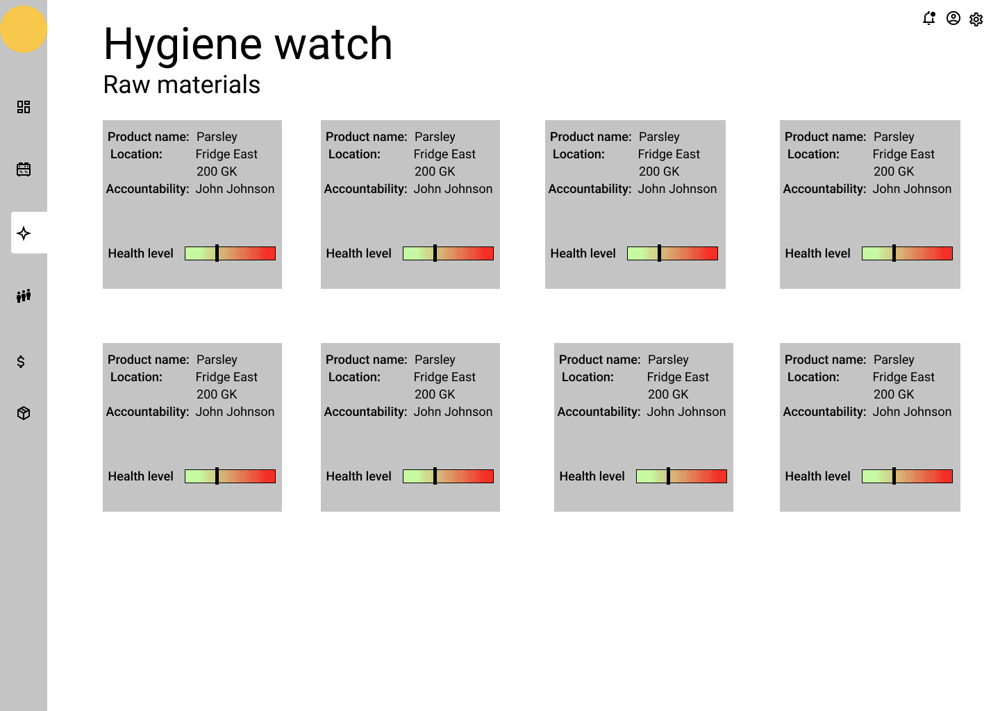
The information architecture separated the overview from the things that need watching — equipment and hygiene — so a manager can move from “is everything fine?” to “what exactly is wrong, and where?” in one step.
From overview to location

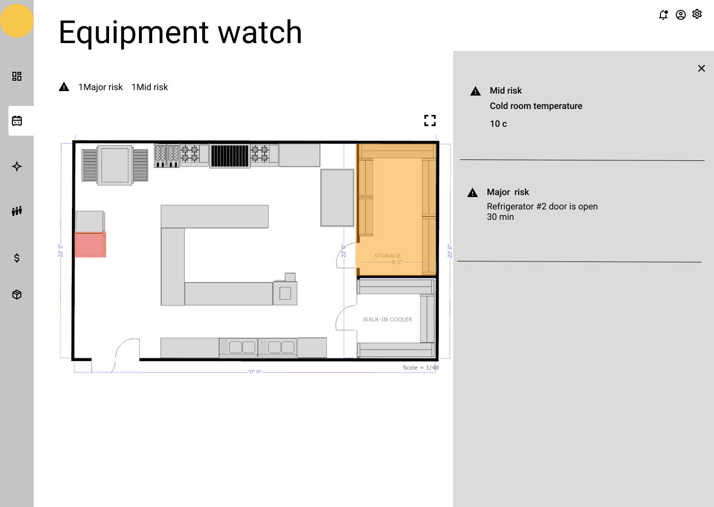
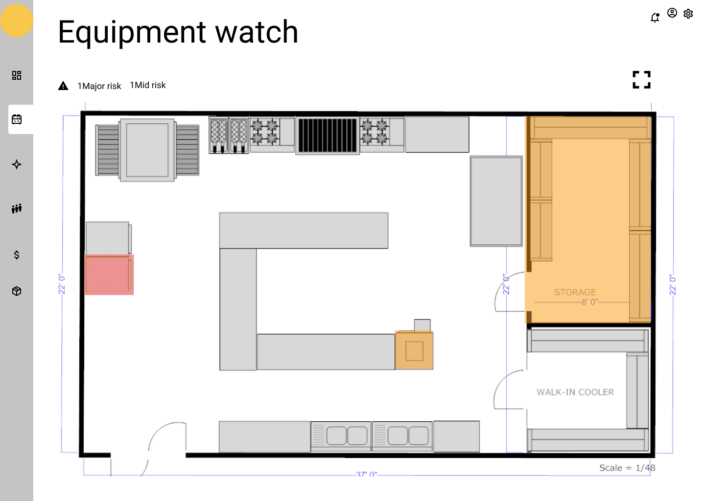
Placing equipment on a floor plan turns an abstract list of alerts into something a manager can walk to. The wireframes became the blueprint for the high-fidelity UI developed later.
Colour that carries meaning
In a tool built around warnings, colour is information. It had to work for everyone reading it.
Decision 1
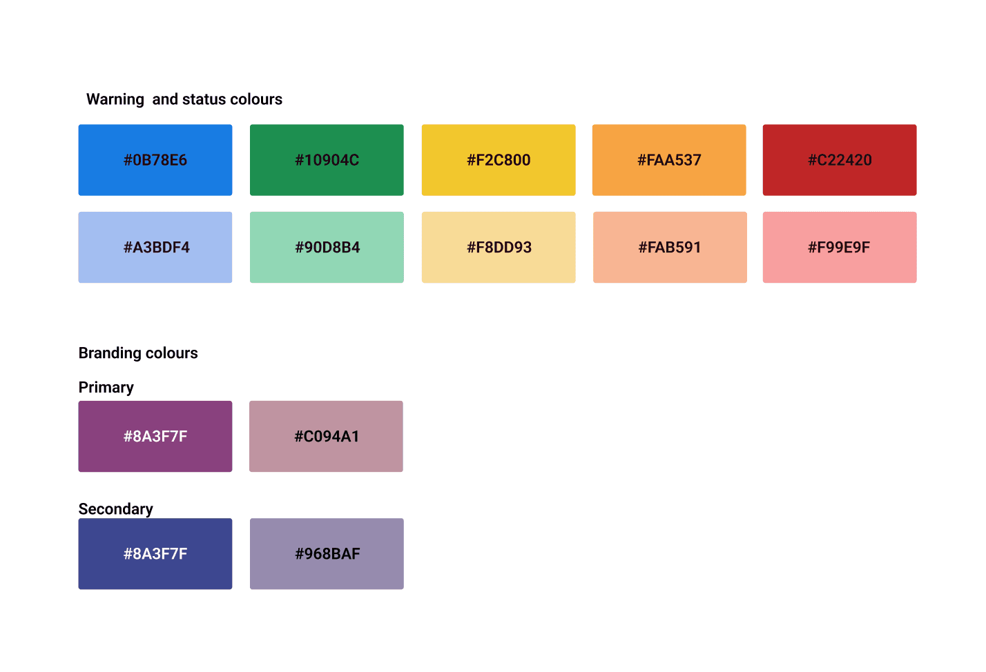
Two warning palettes, both readable with black text
A dark and a pastel palette, each optimised for contrast with black text and tested for colour-blindness.
Why Most of the product’s users were men, who are statistically more likely to have a colour vision deficiency.
Decision 2
Brand colours adapted to AA
One set for backgrounds behind black text, one behind white.
Trade-off Brand guidelines on one side, usability on the other — inclusive without losing the identity.