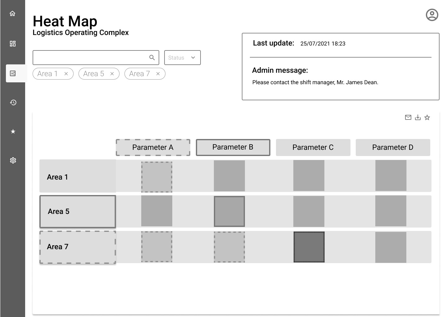
Research
We chose user interviews because we needed qualitative data: the specific needs of users and the why behind their requests. I interviewed four key users from different companies, asking each the same questions based on the research goals and plan.
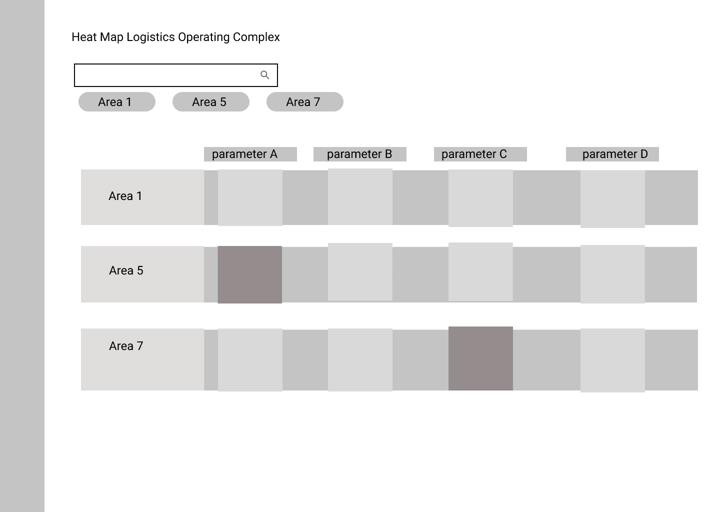
- Users found it hard to find the specific area or perimeter they cared about, and saw information that wasn’t relevant to them.
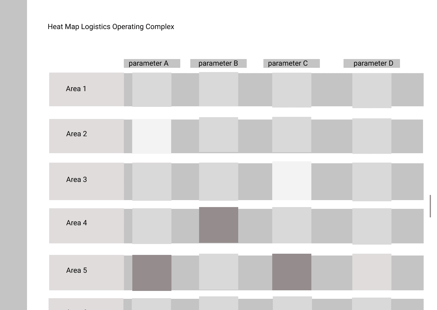
- With many areas, the data became hard to understand.
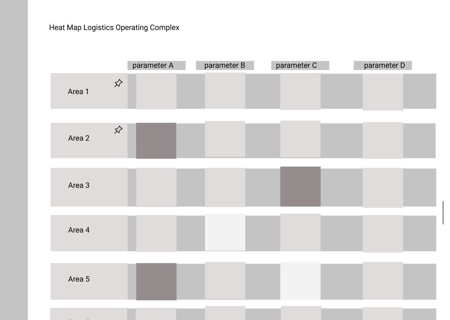
- Users wanted to highlight specific data to share with colleagues.
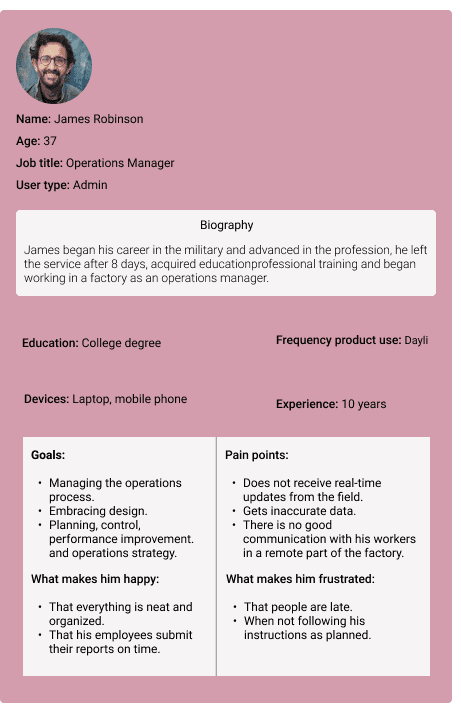
Personas
I created personas from the user and market research, shared them with the development team and kept linking the team’s work back to them. When we designed how an operations manager would examine the map screens, we asked: what is relevant to him, how can we help, and how can we cause less frustration?
Wireframe options
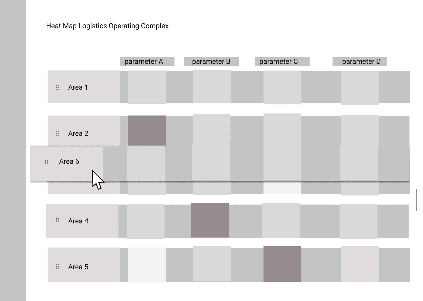
We reviewed the designs with the professional consultants, product managers and developers involved in the feature, asking why it had been created the way it was and getting feedback on four layout options.